Tableau Dear Data Two Interview
39 weeks complete, 1,726 image files, 68 blog posts, 50 Tableau workbooks, 4.3 gigs of data on two Dropbox folders and countless hours of time spent. It’s the Dear Data Two project by Andy Kriebel and Jeffrey Shaffer.
Martha Kang (MK): What is quantified self?
Andy Kriebel (AK): Quantified data is really just collecting data about yourself. There are lots of ways to collect this data, for example there are lots of apps that I use, but it might also be just recording the data in a notebook with pen or pencil. I tend to use a lot of apps to track my data or simply log things in Google Sheets.
Jeff Shaffer (JS): Some great examples of this are Nicholas Felton, who creates an annual report on his life and publishes it each year, called the Feltron Report. In fact, he just recently finished the last year of his 10 year project. Another person to follow is Chris Dancy, who is commonly referred to as “The world’s most connected man”. I heard Chris speak at a Banking Analytics summit and have been following him ever since.
MK: Why did you decide to do the Dear-Data-Two project?
JS: I have been a long-time fan of Giorgia Lupi’s work. I really love her visual designs. I think the common background we share in music also speaks to me in her work. So when I saw the project that Giorgia and Stefanie were doing, it immediately grabbed my attention. I reached out to Andy and after a few exchanges he said, “Sure. Let’s do it.” I was really interested for a number of reasons. First, it looked fun. Second, it was very different from what we typically do day-to-day with technology. Andy and I work in tools like Tableau, R and Alteryx. I was also interested in what our approach was going to yield and how it would be different from the original authors take on it.
AK: Jeff sent me an email in early April and I wasn’t aware of the project at the time. We talked about it a bit and I didn’t think it would take too much time. Once we got further into the project, reality set in. It’s really a royal pain in the ass. I think both Jeff and I have come to have a love-hate relationship with this project week by week. Ultimately, this is a quantified self project, so we are trying to capture the life around us through sketching the hidden patterns found within our data. We’re also having a lot of fun learning about each other - though I’m fairly certain Jeff is pretty terrified by now.
JS: Time has certainly been a factor. It’s a huge amount of time, getting the data together, figuring out how to visualize it, creating the card, taking the pictures and then editing in Photoshop, then writing and posting blog posts and the Tableau stuff.
MK: What’s your most memorable viz and why?
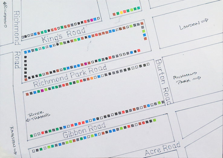
AK: In our talk at the Tableau Conference this year, we ended the presentation with a few of our favorite weeks, both our own and by each other. My favorite postcard of mine so far was Week 24: (Doors). I know Jeff really liked this one too. My daughter and I went out into our neighborhood in London and recorded all of the door colors for all of the nearby houses. We got lots of strange looks, but thankfully no one called the police. The resulting card was really cool and very colorful. This was also a fun week because I allowed me to have some father-daughter time working on the project.
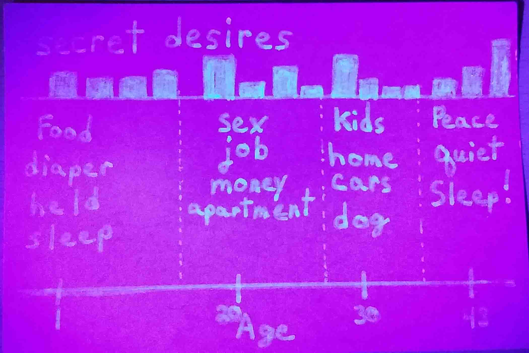
AK: My favorite postcard of Jeff’s is Week 13 (Secrets). You can watch our video from the TCC conference to hear the whole story, but it involved invisible ink and UV light to read the secret viz on the card. I was pretty taken aback at first and thought it was really creepy, but in the end thought it was quite clever.
Jeff's week 13 postcard in UV light:
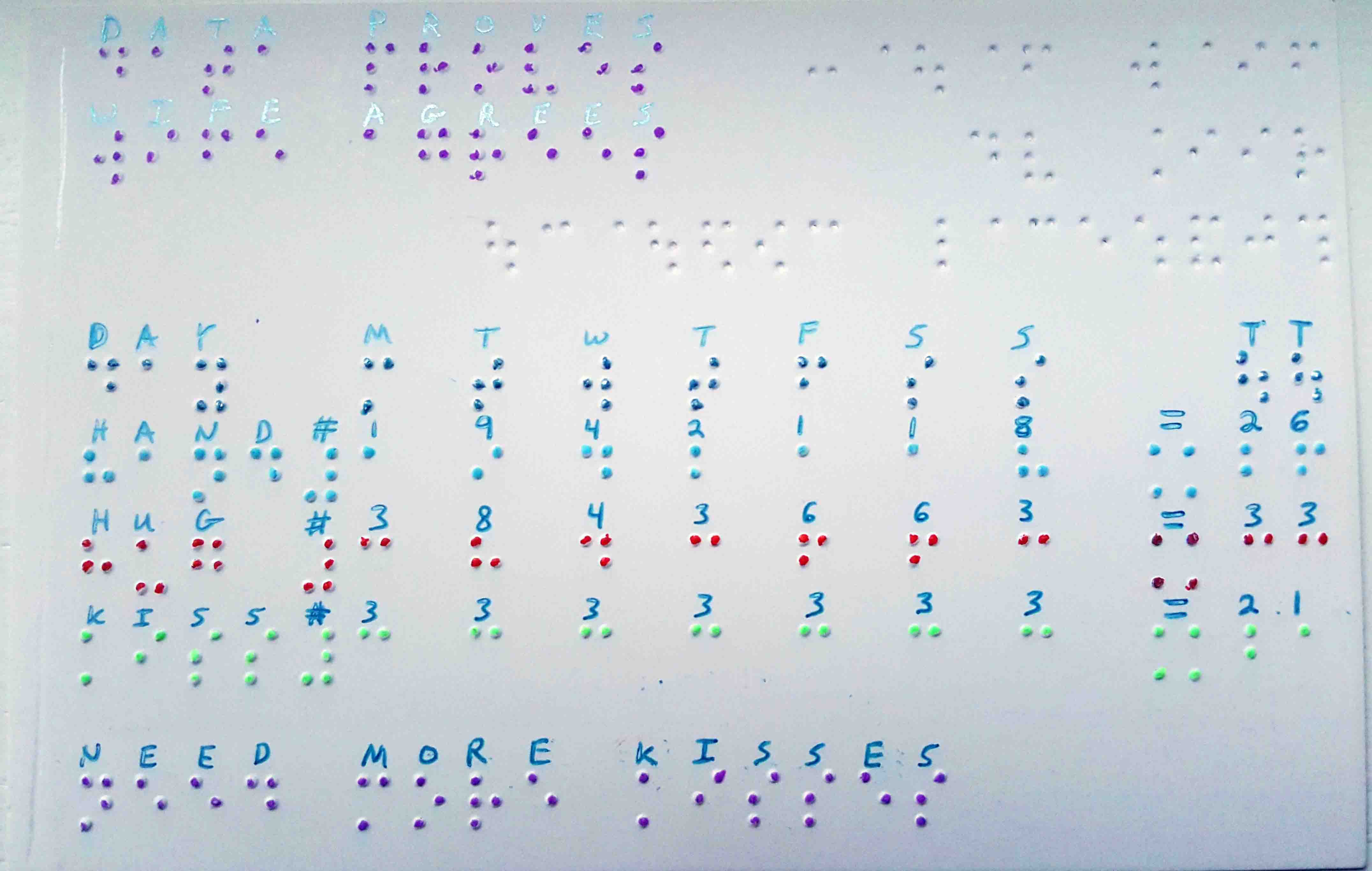
JS: It’s hard to pick favorites, because there are so many. If I had to pick a favorite, I really liked my card for Week 6 (Physical Contact). Considering the topic, I wanted something that could be touched. I ended up using a braille technique, punching braille into the card then coloring the raised dots. I loved the result. I even made a duplicate of this card and sent it to Giorgia.
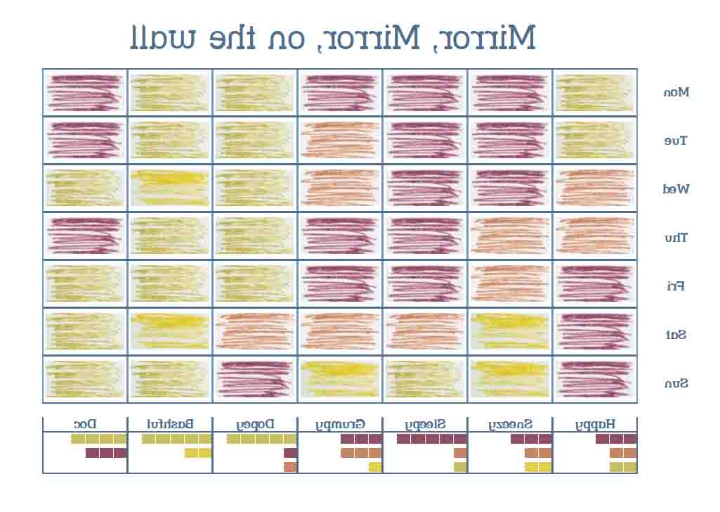
JS: From a Tableau standpoint, I really liked Week 4 (Mirrors) where I created a postcard that had to be read in a mirror. The entire postcard, text and viz were all done backwards. That was really fun to build in Tableau, creating charts that went backwards and finding a backwards font.
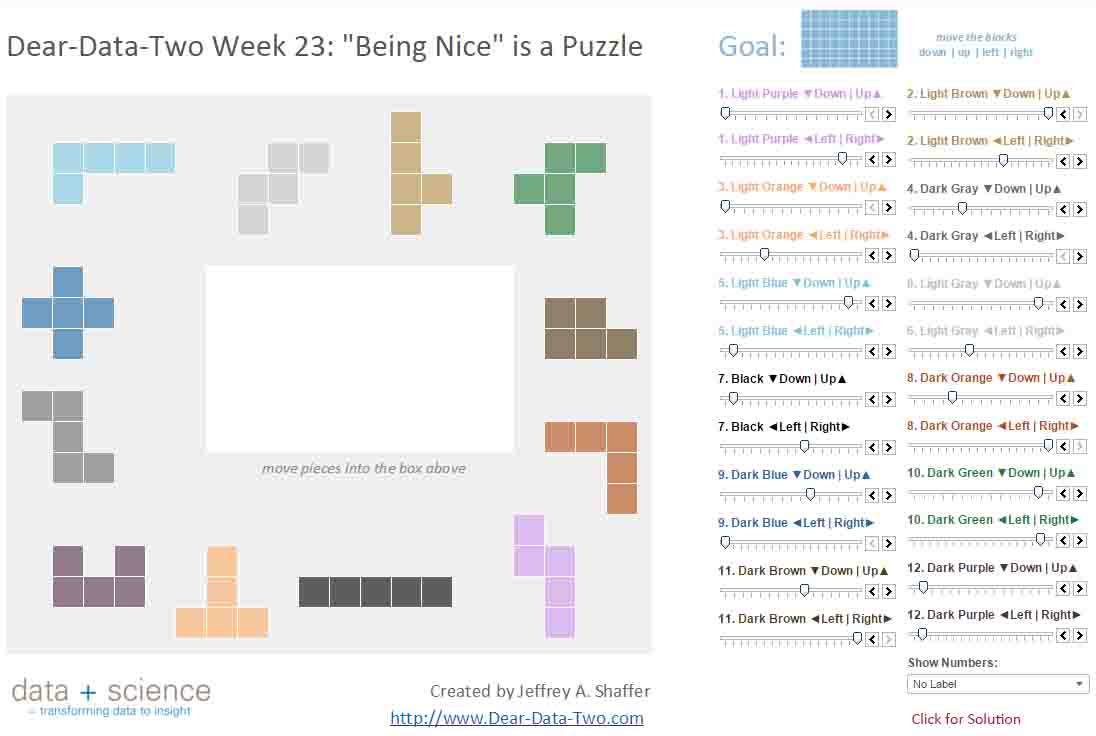
JS: More recently, I created a puzzle viz for Week 23 (Being Nice) and ultimately turned it into a working puzzle game in Tableau using 25 parameters to move the pieces around and to check for the solution.
Click the image below to open then viz:
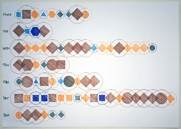
JS: I like so many of Andy’s cards. More recently, in week 28, Andy created a card that used 6 different pre-attentive attributes. He really packed a ton of data into the very small canvas that we have to work with each week.
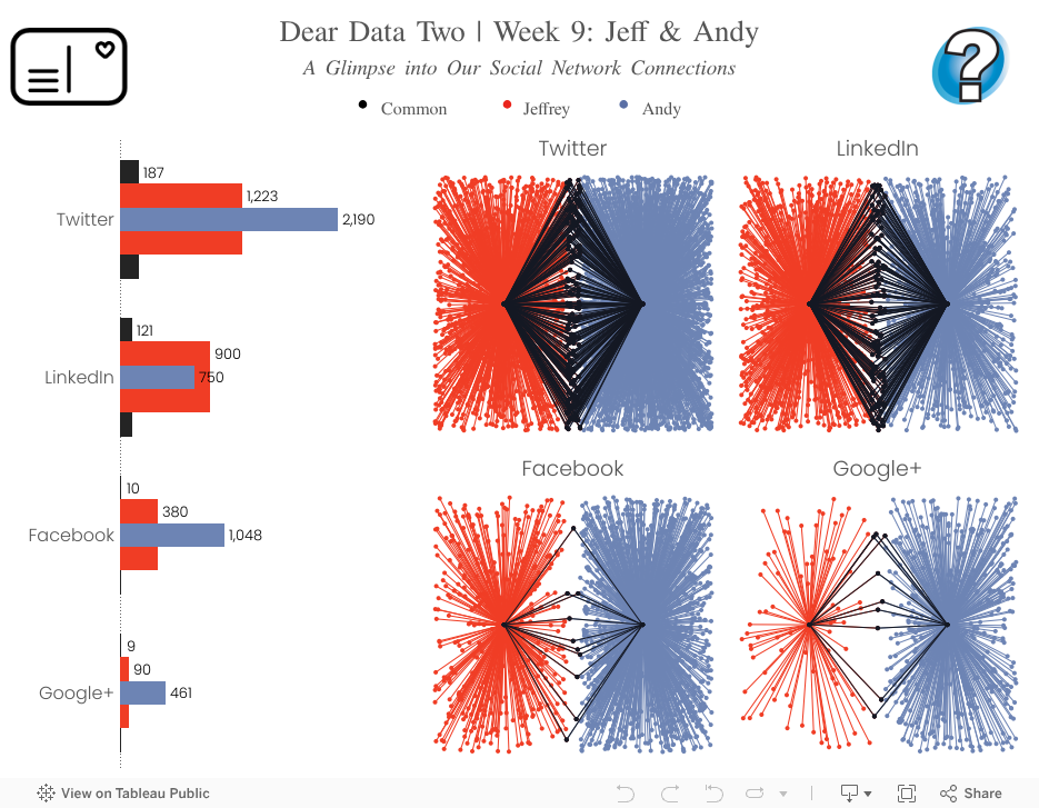
JS: His data gathering and Tableau work on week 9 (Connections) is also really impressive.
MK: What have you learned from this project, about the process or about yourselves?
JS: I will say that I’ve also become much more efficient in the process as I’ve progressed week by week. I simply had too, because it’s so time consuming. I’m certainly more efficient with the tools, especially Tableau, HMTL and Photoshop, but also in getting to my concepts quicker.
The bigger lesson was learning not to get caught in perfection. I often say, “Don’t labor over shades of white”. There’s lots of weeks that I look back on and think, “I’d like to redo that week. I could create something better”, but then there are other weeks where I was really happy with the end result. It’s too easy to get caught in the imperfections of the project, making a mistake on the card and then wanting to redo it and keep redoing it to get it right. In most of my work, especially with gel pens, there’s no undo, which means you really only get one crack at it. You learn to live with the minor mistakes and imperfections, otherwise you’ll never get to the finish line.
AK: Buster Benson has said about quantified self, “Be Aware of the smaller moments that define our lives”. Tracking data week by week, you start to pay attention to the little things that are going on around you that you otherwise would probably ignore. As an example, for week 23, we had to track “Being Nice”. I used the data that week to reflect back on my friends and co-workers on what I should be doing vs. what I was doing. If it weren’t for this project and focusing on the data, there is no way I would have been thinking about that. How many times would I walk through the neighborhood and not truly pay attention to the color of the doors? Now it’s hard not to notice them.
I’ve also noticed that this project has consciously changed my behavior. For example, when I was tracking negative emotions, I felt pretty sad all week. No matter the topic, this project has helped bring those bits of my life to the forefront of my mind each week, moving them from the subconscious to the conscious part of my brain. Surely this effects the data collection.
MK: What differentiates you guys from the original Dear Data project? Or do you think it’s more of a continuation of the original project?
JS: I really tried to be creative and innovative with this project, especially because Giorgia and Stefani did this first. This really took me out of my comfort zone. Besides drawing with gel pens and pencils, I used braille, invisible ink, writing backwards, burning cards with candles and there’s even some more techniques that you’ll see in upcoming weeks. If we thought too much about this in the beginning and realized how amazing the original project was going to be for Giorgia and Stefanie, we probably wouldn’t have done it. Here we are following artists in their footsteps, each week they create these beautiful cards, win numerous awards, etc. Then we come along and create the same thing for the same people to see. There might be the feeling from the data viz community of “Hey look at these guys trying to imitate Dear Data” or “Did you see their awful drawing last week?” We had to put that all aside. We wanted to see what our take on it would look like and how it would be different from the original project, not try to imitate it. At the same time, we both take lots of inspiration from the original authors. I’ve learned a ton throughout this project and I’m thrilled that we decided to do it, but I also agree with Andy, it’s definitely a love-hate relationship week by week. I would say overall, going back in time and knowing what I know now, I would have made the same decision.
AK: For me, the biggest differentiator is that I’m using Tableau to explore the data and try to build my final postcard in Tableau. I saw this project as a way for me to not only be more creative as an artist with pen and paper, but also as a way to push the boundaries of what I know about Tableau. I’ve done things in Tableau that I never thought were possible and I now see Tableau more as a drawing canvas than a charting tool.
JS: I couldn’t agree more.
MK: How has Tableau helped you with this project?
AK: I like to look at what the ladies created each week for inspiration artistically and for a story. This gives me ideas for what I could potentially create in Tableau as a “postcard”. Every week I take my data and the first thing I do is load it into Tableau. Then I start to explore. I generally create a dozen or so visualizations, looking for stories in the data. I then narrow this down into a more refined story and ultimately create my card. Tableau has been an essential part of the process for me from the very beginning.
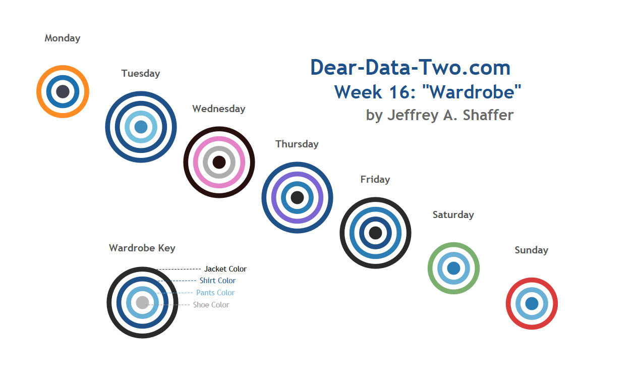
JS: I approach each week nearly the opposite of Andy. I take the data and start sketching on paper. I typically outline a postcard on a blank piece of paper and then sketch ideas, usually some idea that formed during the week. Then I create the postcard. I did this because I didn’t want to be tied down to chart types or tools in Tableau that might force me into thinking of a certain design. I wanted to be free to draw anything. Then for many of the weeks, I’ve gone back and tried to recreate my postcard in Tableau, some more successfully than others. Some weeks have been really challenging, pushing me to try different things in Tableau. For example, week 16 (Wardrobe) where I made color circles into bullseyes with a data set that didn’t have a single measure, only dimensions.
MK: What impact do you think you’ve had on the community?
JS: It’s really great to see others in the community do this. A few people have connected and started to do their own versions of this project. I’ve added it to my data visualization class at the University of Cincinnati and I’ve had excellent feedback. The students really seem to enjoy the project, which is only a single postcard in one week as an assignment. They’ve created some really great work too. More recently, 18 people have come together for Data Chain and are pairing up to send postcards to each other monthly. We’ve inspired some cool Tableau techniques too. I mentioned at the Tableau Conference that week 3 (Thank You) was particularly challenging in Tableau and a few weeks later Brian Prestige from the Information Lab posted an incredible solution here for turning any image into a polygon shape using Photoshop and Alteryx to get the data. That was very cool and will be useful for all kinds of things. And check out Andy’s Tableau technique on week 30 (Time Alone). That was really cool too.
AK: We added this as an exercise at the Data School as well. All of the students at the Data School created a postcard and then mailed it to Jeff. I also got really excited watching our kids participate. My son Oscar decided that he wanted to create a card. So he sat down on his own, downloaded Tableau, went through the training videos, crafted his own postcard and then sent it to Jeff and his family. Oscar is 13! This was proof to me that Tableau is a tool that anyone can learn really quickly.
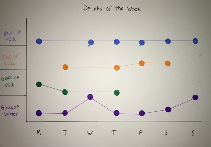
AK: Jeff’s girls then did the same thing, sending a card back to us. When Oscar was finished with his postcard, he said to me, “The organization of the graph has a direct effect on the productiveness of the graph.” That’s a pretty amazing statement coming from someone working for the first time in Tableau and creating his first data visualization. Had it not been for this project, I’m not sure when he would have decided to try Tableau.
JS: On a related note, I attended the Women in Data session at the Tableau conference. A packed room of people supporting a great cause. One of the questions posed was, “how do we get more women into the field of data analytics or in STEM programs in general?” I think projects like this are part of the answer. Here’s a thought:
First, everyone should have a daughter. As a father of twin girls, there is nothing I want more than for my girls to achieve whatever it is they want to do in life. They are dreamers and one of them loves all things science. If we had more dads that were supporting their daughters, maybe we’d have more men supporting women in these efforts.
Second, for young children, I think projects like this are how we can engage children. My girls saw this as a cool project where they could play with colors and make sounds. My daughter Nina tried to turn water into different colors with sprinkles and when that didn’t work she started filling glasses to make musical sounds. Meanwhile, I was getting caught up in making the postcard, but she was enthralled with the glasses and the sounds, i.e., the topic and source of the data. What a great lesson. We need more things like this for our children. Make the topic and data set interesting to them and then they’ll engage.
AK/JS: We’d really like to thank our families for putting up with us for nearly a year now while we did this project. There are lots of late nights and weekend hours devoted to this and often we’re using them as our source of data or inspiration for the postcards. Thank you!
To keep up with the project visit: www.Dear-Data-Two.com